Preliminary task - College Magazine
Ideas for a college magazine
Sporting Events
Music Performances/Bands at College
Student Council and Subject Representatives
End of year Events – Prom/
Student Achievements/ Prize Winners/ Enrichment Activities
College Productions
Guest Speakers
Sexual Health Clinic
Healthy eating
-Choose one main article from above ^
-Medium close up shot
-Contents page
-Prom or a Band (Mate in Prom Dress or Mate Holding a Guitar)
-Healthy eating (Chips contrasted with an healthier option)
Friday, 30 January 2009
Thursday, 29 January 2009
Textual Analysis Feedback
Not a bad effort Karen but you need to use much more in the way of appropriate media terminology, make sure that you mention all of the terms in the glossary we put onto the blog. You also focus too much on the pictures at the expense of other elements such as font design, colour, house style, anchorage, etc., especially in terms of the contents page analysis. You also need to upload the pictures of the magazine that you scanned and make sure that you check your spelling.
Tuesday, 27 January 2009


Friday, 23 January 2009
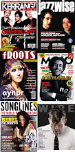
Music Magazine- Kerrang!
Front page-
The target audience would be music fans interested in rock music and heavy metal. The front page is a women which shows that this magazine is aimed more at men with the women been in the centre of the page. It is aimed at a range of different ages from teenagers to adults.
The front cover has an extreme close up of the women’s face and she has bright red lipstick on to show danger and passion. Her place face shows innocence. She has long black hair which contrasts with her pale face and this shows her gothic side which is similar with the music she produces. The female is shown on her own which shows female independence and the males have little pictures at the side which shows the females importance and dominance. The colours on the front of the magazine are mainly black, white and red and black connotes death and horror and red connotes blood and danger and sexuality is shown through her pout which shows the target of males. The name of the female is printed just under her picture in big white capital letters to stand out and shows the importance of her as a female artist.
The title Kerrang sounds like a noise made from instruments used in rock music and the loudness of this sound is shown through the font of kerrang looking like broken glass because of the loudness of the instrument. The title is wrote in big capital letters with white slashes through the text which makes it look like cracked glass to give the magazine an edge to it. The bottom of the page has a number of different band names such as ‘slayer’ and ‘rise against’ which shows that if the reader doesn’t like Evanescence then there are these other bands in the magazine to suit other peoples tastes.
There is a cover line on the front page “Emo Fights Back” which shows the subcultures that would consume these magazines such as ‘Emo’s’. It says “Free Posters” to attract the target audience to buy this magazine so fans can see their favourite bands and cut them out and post them on their wall. “Life Is Loud” is a sell line and also uses alliteration to attract the reader to the piece of text. It also connotes the feelings of listening to rock music and it being loud.
The main cover line on the front of the page is the quote “The darkness inside Amy Lee”. This title sounds grim because of the word ‘darkness’ which shows rock music is quite mysterious.
In between the band names at the top their are little symbols of stars which connotes fame and success and these bands could be the main, best bands. This could also signify the success of the magazine and signify how popular it is. They use grungy types of font for the title, anchorage text and other writing that is usually shown on the cover of the magazine to show that they really are a true rock magazine that appeals to all types of rock music lovers.
Contents page-
At the top of the page ‘contents’ is written in a paint splattered white with a black and red background to make it stand out and look maybe like blood splattered to connote the heaviness of rock and the feelings of metal. It has three images of three male stars and the first image is a male been pulled by loads of hands which shows his fame by the many fans that are grabbing at him. It also connotes that he is a sex symbol by people pulling at him. His facial expression is a crazy one and his mouth is wide open which connotes wildness and rock. The second image is a male in a suit with his hands up to his lips to say ‘shh’ and this shows his mysterious, secretive side. He is shown in a white suit to show his trendiness. He is wearing a stretcher which is stereotypically what a lot of people that are into rock, metal and punk wear, this relates to his image and the sort of music he plays. The third image is a male with a confused face and one squinted eye and his shown in a sort of unstable position to connote him been drunk and crazy.
The main image on the contents page is quite a dark, grim picture of two males against a stone wall and the stone wall signifies an unwelcoming, cold, unwanted feeling. The two males in the image are dresses in black which connotes fear and death. There is a close up of one of the males and he is giving the ‘evils’ to the readers to show his scary side. Both males are shown with long black hair to show the gothic side of them. The male in the background also is giving quite a weird look and his eyes are looking straight at us to give us a feeling or eeriness. The male in the background has a black t shirt on with a white skeleton on the front and skeletons connote death and bones which gives us the sense of feeling of listening to rock. The images on the page show attitude.
The font is in red and black which are the main colours on the front page and these colours connote danger and blood and death. The font is in capitals to stand out to the readers. The numbers are in black and white because they are main colours and these attract the reader first so that they can turn to the page of what they are interested in.
Double page spread-
The font at the top of this page says ‘Breaker’ in splattered white writing to signify smashed glass because of the word ‘break’. The articles feature headline “We’re trying to make a difference” is wrote in bold white capitals so it stands out but it also has black lines through the letters to make it look like the letters have been sliced into pieces and this gives a sense of attitude. The articles headline “Killswitch engage get fired up on new album” is written on orange background with black letters, the orange is there to represent the word ‘fired’.
The five males are all shown as dominat characters with their up right position and their serious faces. They are up against a quite dark background so their facial expressions stand out. The first male to the left has tatoos which signify his attitude and dominance. He is also bald headed which connotes quite a rough looking character. The second male has long wavy hair and a lot of rock people have long hair what they can throw about when rocking out, his arms are also crossed which shows his masculinity. The male in the middle also has a bald head which connotes rough males. The males on the right are shown with quite grim, serious faces and the male on the end has a bright red skull on his black t-shirt which connotes death.
The background of the picture is mostly black with peice of jagged wood sticking out everywhere which shows quite a rough side because wood is rough.
The interview with the band is written in little white writing and has headlines which have meanings like "As Daylight Dies" and "The Arms Of Sorrow" and "My Curse" and "Reject Yourself" and certain words in these headlines connote death and rejection and horror and they all add to the genre of rock and have quite a gothic feeling.
Subscribe to:
Comments (Atom)