Media Evaluation
In what ways does your media product use, develop or challenge forms and conventions of real media products?
Well my media product is a music magazine and all music magazines need to have a star on their front page what will represent the magazine so I used Amy and made sure she had a lot of make-up on and a girly dress. She also had big blonde hair and she represented a pop star as they all have big hair, a lot of make-up and nice fashionable clothes. My colour scheme throughout the magazine was pastel colours like baby pink, blue and green and they were the main house colours. Most of my images are medium close ups which is common in music magazines. I also used a boy band interview for my double page spread which girls would like to read and I made it humorous. Interviews are always found in Pop magazines and there are also a lot of photos of females and males in Pop magazines. My media magazine also has a bar code on which you see on all magazines. My double page spread also uses drop down capitals which is a convention in magazines.
How does your media product represent particular social groups?
My media product connotes a kind of girly look and it represents social groups that are females in secondary school or in college that are interested in music, fashion, beauty. I reckon it would be aimed at big female friendship groups that all get together and read it. Then again I feel my magazine is quite open and a magazine for all audiences. My magazine social group comes across in the Boy band interview when they are on about females, fame and parties and this is all a sort of popular culture.
What kind of media institution might distribute your media product and why?
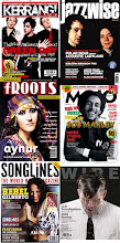
A main stream institution would distribute my magazine as pop is a very large popular music. Pop also is quite mainstream as its not individually based like heavy metal which is just aimed at people that like that music. Bauer would be a good media institution as it is very large and has a high population readership which means a lot of people are interested in the magazines, this way we could attract a big audience and earn a lot of money. Bauer sells a lot of popular magazine like Closer, Heat etc
Who would be the audience for your media product?
The audience that is targeted in my media product is more at females I'd say and this shows in the house colours of the magazine which are pastel colours like baby pink and baby blue. It is also aimed at younger teenagers who are into all sorts of music really but mostly pop based. It is also aimed more at females because of the double page spread all about boys and loads of pictures of boys which would be a girl’s ideal partner. There is also pictures of females thought too which would give it more a male target.
How did you attract/address your audience?
I tried to attract my audience by using accesive language and I also used colloquial language in my double page spread. I also attracted my audience by using an image that females would think of their ideal self on the front cover. I didn’t have too much text on my front page because that can sometimes put the reader off. I also attracted my audience by aiming it at females and using pretty colours which would attract readers. The masthead was also made to stand out to attract people because if this was in a shop behind other magazines, the masthead would stand out next to all the rest.
What have you learnt about technologies from the process of constructing this product?
I have learnt how to use Quark and Photoshop; I have never used these before. I have learnt how to manage a blog and add posts and save my files as PDF and JPEG.
Looking back at your preliminary task, what do you feel you have learnt in the progression from it to the full product?
I personally think my preliminary task was a lot easier then the final product and I also find I have done better in my double page spread in my pre-lim task then in my final. I feel I have learnt how to use Quark and Photoshop in a more advanced way too then when I had done my pre-lim task.
Glossary Of Key Terms For A Music Magazine :
Masthead- This is the title for the magazine
Plug: Information about the contents of a magazine or newspaper given on the front cover
Puff: Words or phrases on the cover of a magazine used to boost status
Mode Of Address- Which audience the magazine is aimed at
Sell Lines- This is some text on the cover that helps sell the magazine
E.g- Kerrang- 'Life Is Loud'
Drop Capitals- At the start of a new topic or at the beggining of the article will be a big bold capital letter which stands out
Banners- A coloured block which text stands out on
House Style- A few main colours that disguises that mgazine from the rest, gives it some individuality
Borders- The gaps round the outside of the page which are usually kept plain

These are fonts that I think are suitable for a Pop magazine because they are big and bold and cartoony and I got these from the cartoon section on www.dafonts.com
These are the sort of fonts that would stand out as a masthead and in a shop. I've also wrote in the font music box instead of pop because now people are telling me music box is a better title than pop because pop is quite bland.
Treatment
Synopsis
My magazine is going to be called POP and it’s going to aimed at teenagers, preferably more girls than boys because it will have gossip about music stars in it.
Detail of Target Audience
-My Target Audience is aimed at teenagers because it’s a magazine that is based round pop and RnB music which appeals to children and the age would be 12-24 year olds. It is aimed at both Males and Females because for females the people in the magazine is their ideal self but for the Males it’s their ideal partner. Its aimed at people who are interested in pop music, RnB music.
Front Cover Photography:
-Girl on Knees, Holding A Pink Guitar, Black Hair All Backcombed and Wild.
-Location- Coloured Background, No Clutter, inside a room.
-Jeans and a Baggy Top, Red Lipstick and Red Blusher <>Contents Page:
-Loads of small photos of bands with dark backgrounds
- I am going to need about 5 photographs for this.
Double Page Spread:
-Picture of Band, Medium Shot, and Text written over top, Hot Pink Coloured Background.
- I am going to need one big picture and about 6 small photos.
- My article is going to be about a band and in a Q & A format
Interview/Article:
-Q and A format
-Questions about what their favourite song is,
who influences/inspires them, if theyve been busy,
are they bringing a new album out? whats their fave song?
whats their best video?
Initial Recce considerations
I think my photography is going to be taken inside so I don’t think there are any health and safety risks unless I am taking pictures outside near bridges and water etc. Also I am not using electrical wires which would be dangerous and could trip. I must not shine bright lights at my person or it will blind them and I’ll have to be careful not too burn them with the lighting so I should have my lights high up and in a safe place so they don’t fall. If there was to be a fire people would have to evacuate from the building by the nearest fire exit sensibly. If I am taking pictures at College the nearest first aider people would be Rob and Vicky but if I am taking them at home it would be my Dad