Friday, 26 June 2009


Thursday, 25 June 2009
Monday, 22 June 2009
Lesson Objective
My lesson objective for today is to edit the footage/ shot last week in order to fulfill assesment objective 3
ScreenPlay
Embarrassing Situation,
Draft 1,
18/06/09
Karen Conlon, Jade, Amy, Jamie, Jack
1) EXT. COLLEGE – DAYTIME
There is an establishing wide long shot outside college during the day at lunchtime showing students walking around. The setting is noisy and busy with natural sounds of laughing and voices.
Cut to:
2) INT. RECEPTION – LUNCHTIME
There is a master wide long shot of Person A and B in the reception in mid conversation.
Person A
So we going out this Friday then?
Person B
Yeah, I’m up for it, Pop or Liquid?
Person A
(Shouts Excitedly)
POP!
Person B
I’ll see you Friday then
There is a medium close up of the two people talking, Person A to the right and Person B to the left. Person A fiddles with her bag looking for something.
Person A
Yeah, see you Friday, Bye.
There is an extreme close up shot of the bag showing something falling out.
Medium shot – Shows item fall and camera follow it in slow motion.
Close up shot – Object on ground.
Cut to:
6) EXT. COLLEGE GROUNDS – LUNCHTIME
Camera pans and rises to medium long shot of Person A walking outside.
Cut to:
7) INT. RECEPTION – LUNCHTIME
Eye line match – Person B looking at object.
Cut to:
8) EXT. COLLEGE GROUNDS – LUNCHTIME
Close up – Person A still walking off.
Cut to:
9) INT. RECEPTION – LUNCHTIME
Long Shot – Person B bends down and picks up the object.
Insert shot to hand and object.
Medium shot as Person B stands up
Medium close up, over the shoulder shot, reaction shot- Shot reverse shot as Person B looks in their hand
Person B
Wait, you’ve dropped this.
Shot reverse shot to Person A, over the shoulder reaction shot.
Back to Person B in shot reverse shot.
Cut to:
10) EXT. OUTSIDE – LUNCHTIME
Person B walks outside and it’s a Medium long shot of both of them.
Person A
(Embarrassed Face)
Oh thanks.
Tuesday, 16 June 2009
Establishing shot - College
2nd Establishing shot in reception
Medium shot of person A and BA fiddles with bag, insert shot on an object perhaps about to fall out of the bag - signifying
Back to medium(long?) shot of A&B - Bag in view
See the Item fall, Slow Motion? - Camera follows object?
Person B Medium close up, eyeline match shot to object
Insert Shot of object. High
AnglePerson A medium close up, still conversing.
Long Shot on BothB goes to pick up object, medium close up to show B bending down then insert shot to hand and the object.
Medium long shot whilst B stands back up
Medium close up, shot reverse shot (Over the shoulder) - reaction shots
Medium long on both, begin to pass the object over, close up on both hands and objects
Close up on A, reaction shot
Shot reverse shot to A and B
A says thanks, long shot
end?
Monday, 15 June 2009
- Lesson Objectives
1) Complete a screenplay for my introduction to Unit G324: Advanced Portfolio Video Task
2)Complete a stroryboard for my introduction to Unit G324: Advanced Portfolio Video Task
Introduction to Unit G324: Advanced Portfolio- Assesment Objectives
The purpose of this unit is firstly to assess your ability to plan and construct media products using appropriate technical and creative skills (AO3); secondly to assess your ability to apply knowledge and understanding in evaluating your own work, showing how meanings and responses are created (AO2); and finally to assess your ability to undertake, apply and present appropriate research (AO4).The unit requires you to engage with contemporary media technologies, giving you the opportunity to develop your own skills in these technologies. It also enables you to develop the skills of presentation that are required for further study at higher levels and in the workplace.
Friday, 8 May 2009

Tuesday, 21 April 2009


Media Evaluation
In what ways does your media product use, develop or challenge forms and conventions of real media products?
Well my media product is a music magazine and all music magazines need to have a star on their front page what will represent the magazine so I used Amy and made sure she had a lot of make-up on and a girly dress. She also had big blonde hair and she represented a pop star as they all have big hair, a lot of make-up and nice fashionable clothes. My colour scheme throughout the magazine was pastel colours like baby pink, blue and green and they were the main house colours. Most of my images are medium close ups which is common in music magazines. I also used a boy band interview for my double page spread which girls would like to read and I made it humorous. Interviews are always found in Pop magazines and there are also a lot of photos of females and males in Pop magazines. My media magazine also has a bar code on which you see on all magazines. My double page spread also uses drop down capitals which is a convention in magazines.
How does your media product represent particular social groups?
My media product connotes a kind of girly look and it represents social groups that are females in secondary school or in college that are interested in music, fashion, beauty. I reckon it would be aimed at big female friendship groups that all get together and read it. Then again I feel my magazine is quite open and a magazine for all audiences. My magazine social group comes across in the Boy band interview when they are on about females, fame and parties and this is all a sort of popular culture.
What kind of media institution might distribute your media product and why?
A main stream institution would distribute my magazine as pop is a very large popular music. Pop also is quite mainstream as its not individually based like heavy metal which is just aimed at people that like that music. Bauer would be a good media institution as it is very large and has a high population readership which means a lot of people are interested in the magazines, this way we could attract a big audience and earn a lot of money. Bauer sells a lot of popular magazine like Closer, Heat etc
Who would be the audience for your media product?
The audience that is targeted in my media product is more at females I'd say and this shows in the house colours of the magazine which are pastel colours like baby pink and baby blue. It is also aimed at younger teenagers who are into all sorts of music really but mostly pop based. It is also aimed more at females because of the double page spread all about boys and loads of pictures of boys which would be a girl’s ideal partner. There is also pictures of females thought too which would give it more a male target.
How did you attract/address your audience?
I tried to attract my audience by using accesive language and I also used colloquial language in my double page spread. I also attracted my audience by using an image that females would think of their ideal self on the front cover. I didn’t have too much text on my front page because that can sometimes put the reader off. I also attracted my audience by aiming it at females and using pretty colours which would attract readers. The masthead was also made to stand out to attract people because if this was in a shop behind other magazines, the masthead would stand out next to all the rest.
What have you learnt about technologies from the process of constructing this product?
I have learnt how to use Quark and Photoshop; I have never used these before. I have learnt how to manage a blog and add posts and save my files as PDF and JPEG.
Looking back at your preliminary task, what do you feel you have learnt in the progression from it to the full product?
I personally think my preliminary task was a lot easier then the final product and I also find I have done better in my double page spread in my pre-lim task then in my final. I feel I have learnt how to use Quark and Photoshop in a more advanced way too then when I had done my pre-lim task.
Friday, 3 April 2009
Glossary Of Key Terms For A Music Magazine :
Masthead- This is the title for the magazine
Plug: Information about the contents of a magazine or newspaper given on the front cover
Puff: Words or phrases on the cover of a magazine used to boost status
Mode Of Address- Which audience the magazine is aimed at
Sell Lines- This is some text on the cover that helps sell the magazine
E.g- Kerrang- 'Life Is Loud'
Drop Capitals- At the start of a new topic or at the beggining of the article will be a big bold capital letter which stands out
Banners- A coloured block which text stands out on
House Style- A few main colours that disguises that mgazine from the rest, gives it some individuality
Borders- The gaps round the outside of the page which are usually kept plain
Thursday, 2 April 2009

These are fonts that I think are suitable for a Pop magazine because they are big and bold and cartoony and I got these from the cartoon section on www.dafonts.com
These are the sort of fonts that would stand out as a masthead and in a shop. I've also wrote in the font music box instead of pop because now people are telling me music box is a better title than pop because pop is quite bland.
Treatment
Synopsis
My magazine is going to be called POP and it’s going to aimed at teenagers, preferably more girls than boys because it will have gossip about music stars in it.
Detail of Target Audience
-My Target Audience is aimed at teenagers because it’s a magazine that is based round pop and RnB music which appeals to children and the age would be 12-24 year olds. It is aimed at both Males and Females because for females the people in the magazine is their ideal self but for the Males it’s their ideal partner. Its aimed at people who are interested in pop music, RnB music.
Front Cover Photography:
-Girl on Knees, Holding A Pink Guitar, Black Hair All Backcombed and Wild.
-Location- Coloured Background, No Clutter, inside a room.
-Jeans and a Baggy Top, Red Lipstick and Red Blusher <>Contents Page:
-Loads of small photos of bands with dark backgrounds
- I am going to need about 5 photographs for this.
Double Page Spread:
-Picture of Band, Medium Shot, and Text written over top, Hot Pink Coloured Background.
- I am going to need one big picture and about 6 small photos.
- My article is going to be about a band and in a Q & A format
Interview/Article:
-Q and A format
-Questions about what their favourite song is,
who influences/inspires them, if theyve been busy,
are they bringing a new album out? whats their fave song?
whats their best video?
Initial Recce considerations
I think my photography is going to be taken inside so I don’t think there are any health and safety risks unless I am taking pictures outside near bridges and water etc. Also I am not using electrical wires which would be dangerous and could trip. I must not shine bright lights at my person or it will blind them and I’ll have to be careful not too burn them with the lighting so I should have my lights high up and in a safe place so they don’t fall. If there was to be a fire people would have to evacuate from the building by the nearest fire exit sensibly. If I am taking pictures at College the nearest first aider people would be Rob and Vicky but if I am taking them at home it would be my Dad
Friday, 27 March 2009

Medium Shot
Enough Room For A Masthead But Unclear Photo And Not A Medium Shot
Enough Room For Masthead But A Cluttered Background
Thursday, 26 March 2009

Tuesday, 24 March 2009


Monday, 23 March 2009
Magazine Links:
Contemporary Music
http://www.nme.com/home
Hip Hop
http://www.vibe.com/
Hip Hop
http://www.thesource.com/
Thursday, 19 March 2009


Starter Task: Double Page Spread- Features
- Interview
- Pull Quote- Something Interesting Took Out And Made Bigger
-Band People- History, Album
-Expose- Personal Insight Into The Band
-Festival Guide- Main Attraction
-Top 100 Artist- Number 1
Genereic Elements
-Image
-Article Title
Tuesday, 17 March 2009


17/3/09 - Made some changes
Took the top centred photo when I went too Pcd and Lady GaGa Concert On Feb 5th
Friday, 13 March 2009

Thursday, 12 March 2009
What makes a good cover image?
5 rules
- No cluttered background
- Focus on the lead singer
- If it is a single artist make sure it is a medium shot- close up
- Leave room for a masthead (dont cut off heads!)
- No high angle shots
- Animate your band- make sure they look at the camera
Whats wrong with this picture as a cover shot?
1st)
-it looks unprofessional
-it’s a wide shot
-not close enough (long shot)
-too much background
-people not looking at camera
2nd)
-too long
-too much space up above them
-low angle shot (don’t know who main singer is)
-busy background
3rd)
-boring, nothing happening
-long shot
-not positioned
-can’t fit a masthead on
4th)
-high angle long shot
-dull background (colours)
-they don’t look dominant
5th
-not looking at camera
-shows background
-he looks boring

Tuesday, 10 March 2009
Objective 10/3/09
Ideas for main cover image and look at google images of music magazines for ideas
-Girl with electric pink guitar and her black hair in her face with a black or white background.
-Girl stood up with a microphone.
-Extreme close up of girl with headphones on.
-Lady Gaga or Pussycat dolls on front image in their pose.
Objective 9.3.09
look at fonts for masthead of my music magazine and get some feedback which i have underneath
Friday, 6 March 2009

Objective 6.3.09
need to change my contents page so theirs two different photos of people, not of the same person
need to change my contents page so theirs two different photos of people, not of the same person
Thursday, 5 March 2009
Objective: 5.3.09
Mainstream Product: A product that is produced for a wider audience and appeals to a lot of people so it has a high readership.
Niche Product: A product that is based on something in particular and something only certain people will read because has specific things that attract people. It will have a smaller readership than a mainstream magazine. E.g Terrorising Metal
Target Audience & Titles of magazines & Connotations
Mainstream
Age- 16- 30
Gender- Females & Males
Tune in- Where you tune in on a guitar. Sub genre- Rock
Music Box- A 19th century automatic musical instrument Sub genre- Pop
Tuneful- Tunez- Good Music. Sub genre- Pop
Chant- Loads of people shouting at once. Sub genre- Rap
Racket- Loud noises that annoy people. Sub genre- Rock/Metal
Beatz- Sub genre- Hip hop/ R&B
Spit- Spitting bars. Sub genre- Hip hop/ R&B/ Rap
Wavez- Sub genre- Hip hop/ R&B
Vault- Sub genre- Bassline
Skank- Sub genre- Bassline
Pop- Sub genre- Pop music
Tuesday, 3 March 2009
Objective 3.3.09
Research on Bauer
Bauer is Europe’s largest privately owned publishing Group and it offers over 230 magazines. It publishes in Germany, France, Spain, Portugal and the United Kingdom. They only have 6,600 employees worldwide but 1.79 billion euro. Bauer have a range of magazines from Closer and Heat to Country Walking and Golf World. In 1987 Bella was launched in the UK and it currently sells 224,013 copies every week and has 821,000 readerships. Bella is a popular magazine with women and the title quickly became market leader. In 1999 TV choice was launched and it currently sells 1,369,088 copies every week and has 1,828,000 readerships. Bauer Media reaches over nineteen million UK adults across multiple media channels and they own more than eighty influential media brands.
Monday, 2 March 2009
Thursday, 26 February 2009


Friday, 30 January 2009
Preliminary task - College Magazine
Ideas for a college magazine
Sporting Events
Music Performances/Bands at College
Student Council and Subject Representatives
End of year Events – Prom/
Student Achievements/ Prize Winners/ Enrichment Activities
College Productions
Guest Speakers
Sexual Health Clinic
Healthy eating
-Choose one main article from above ^
-Medium close up shot
-Contents page
-Prom or a Band (Mate in Prom Dress or Mate Holding a Guitar)
-Healthy eating (Chips contrasted with an healthier option)
Thursday, 29 January 2009
Textual Analysis Feedback
Not a bad effort Karen but you need to use much more in the way of appropriate media terminology, make sure that you mention all of the terms in the glossary we put onto the blog. You also focus too much on the pictures at the expense of other elements such as font design, colour, house style, anchorage, etc., especially in terms of the contents page analysis. You also need to upload the pictures of the magazine that you scanned and make sure that you check your spelling.
Tuesday, 27 January 2009


Friday, 23 January 2009
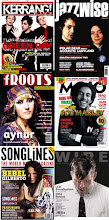
Music Magazine- Kerrang!
Front page-
The target audience would be music fans interested in rock music and heavy metal. The front page is a women which shows that this magazine is aimed more at men with the women been in the centre of the page. It is aimed at a range of different ages from teenagers to adults.
The front cover has an extreme close up of the women’s face and she has bright red lipstick on to show danger and passion. Her place face shows innocence. She has long black hair which contrasts with her pale face and this shows her gothic side which is similar with the music she produces. The female is shown on her own which shows female independence and the males have little pictures at the side which shows the females importance and dominance. The colours on the front of the magazine are mainly black, white and red and black connotes death and horror and red connotes blood and danger and sexuality is shown through her pout which shows the target of males. The name of the female is printed just under her picture in big white capital letters to stand out and shows the importance of her as a female artist.
The title Kerrang sounds like a noise made from instruments used in rock music and the loudness of this sound is shown through the font of kerrang looking like broken glass because of the loudness of the instrument. The title is wrote in big capital letters with white slashes through the text which makes it look like cracked glass to give the magazine an edge to it. The bottom of the page has a number of different band names such as ‘slayer’ and ‘rise against’ which shows that if the reader doesn’t like Evanescence then there are these other bands in the magazine to suit other peoples tastes.
There is a cover line on the front page “Emo Fights Back” which shows the subcultures that would consume these magazines such as ‘Emo’s’. It says “Free Posters” to attract the target audience to buy this magazine so fans can see their favourite bands and cut them out and post them on their wall. “Life Is Loud” is a sell line and also uses alliteration to attract the reader to the piece of text. It also connotes the feelings of listening to rock music and it being loud.
The main cover line on the front of the page is the quote “The darkness inside Amy Lee”. This title sounds grim because of the word ‘darkness’ which shows rock music is quite mysterious.
In between the band names at the top their are little symbols of stars which connotes fame and success and these bands could be the main, best bands. This could also signify the success of the magazine and signify how popular it is. They use grungy types of font for the title, anchorage text and other writing that is usually shown on the cover of the magazine to show that they really are a true rock magazine that appeals to all types of rock music lovers.
Contents page-
At the top of the page ‘contents’ is written in a paint splattered white with a black and red background to make it stand out and look maybe like blood splattered to connote the heaviness of rock and the feelings of metal. It has three images of three male stars and the first image is a male been pulled by loads of hands which shows his fame by the many fans that are grabbing at him. It also connotes that he is a sex symbol by people pulling at him. His facial expression is a crazy one and his mouth is wide open which connotes wildness and rock. The second image is a male in a suit with his hands up to his lips to say ‘shh’ and this shows his mysterious, secretive side. He is shown in a white suit to show his trendiness. He is wearing a stretcher which is stereotypically what a lot of people that are into rock, metal and punk wear, this relates to his image and the sort of music he plays. The third image is a male with a confused face and one squinted eye and his shown in a sort of unstable position to connote him been drunk and crazy.
The main image on the contents page is quite a dark, grim picture of two males against a stone wall and the stone wall signifies an unwelcoming, cold, unwanted feeling. The two males in the image are dresses in black which connotes fear and death. There is a close up of one of the males and he is giving the ‘evils’ to the readers to show his scary side. Both males are shown with long black hair to show the gothic side of them. The male in the background also is giving quite a weird look and his eyes are looking straight at us to give us a feeling or eeriness. The male in the background has a black t shirt on with a white skeleton on the front and skeletons connote death and bones which gives us the sense of feeling of listening to rock. The images on the page show attitude.
The font is in red and black which are the main colours on the front page and these colours connote danger and blood and death. The font is in capitals to stand out to the readers. The numbers are in black and white because they are main colours and these attract the reader first so that they can turn to the page of what they are interested in.
Double page spread-
The font at the top of this page says ‘Breaker’ in splattered white writing to signify smashed glass because of the word ‘break’. The articles feature headline “We’re trying to make a difference” is wrote in bold white capitals so it stands out but it also has black lines through the letters to make it look like the letters have been sliced into pieces and this gives a sense of attitude. The articles headline “Killswitch engage get fired up on new album” is written on orange background with black letters, the orange is there to represent the word ‘fired’.
The five males are all shown as dominat characters with their up right position and their serious faces. They are up against a quite dark background so their facial expressions stand out. The first male to the left has tatoos which signify his attitude and dominance. He is also bald headed which connotes quite a rough looking character. The second male has long wavy hair and a lot of rock people have long hair what they can throw about when rocking out, his arms are also crossed which shows his masculinity. The male in the middle also has a bald head which connotes rough males. The males on the right are shown with quite grim, serious faces and the male on the end has a bright red skull on his black t-shirt which connotes death.
The background of the picture is mostly black with peice of jagged wood sticking out everywhere which shows quite a rough side because wood is rough.
The interview with the band is written in little white writing and has headlines which have meanings like "As Daylight Dies" and "The Arms Of Sorrow" and "My Curse" and "Reject Yourself" and certain words in these headlines connote death and rejection and horror and they all add to the genre of rock and have quite a gothic feeling.
Subscribe to:
Comments (Atom)